Photojournalism - Commercials

Freitag, 21. November 2014

PhotoJ - Fashion Photography

1. At first they put a lot of make-up on the model, then they stretched her neck, so that she looks taller. The next steps were, that they made the neck and shoulders smaller and put the eyes a little bit down. After that they enlarged the eyes and added a little bit of structure to the face.

2. First they enlarged the eyes of the model and made the nose look thinner. Then they thinned the arms and her stomach. After that, they stretched the legs and thinned the legs and feet and also stretched her neck and arms to make her look taller. At last they brightened her skin and hair. 

3. First of all, they thinned all of her body: her legs, her arms, her butt,… Then they formed her body to look thinner and smoothed all of wrinkles and uncleannesses of the body. The next steps were still forming and thinning the body. Then they painted her long hair and are still improving her stomach and arms. After that they thinned her face a little bit and added more volume to her hair. At last they brightened up the whole picture and improved her skin color.

4. Questions:

  1. Is it ethically acceptable to change a person's appearance like these in a photo? Why or why not?
    • I think it is not acceptable because first of all it gives the person whose picture is getting improved, the feeling of being ''ugly'' and not acceptable the way they are and also it shows other people, especially teenager and people who still need to find themselves, that you are not beautiful the way you are and that you have to improve yourself to be accepted.
  2. Are there circumstances in which it would be more ethically wrong to do this type of manipulation?
    • Yes there are. I would say it is ''more'' wrong when especially young people can see the manipulation, because they are more suggestible and like I said in the first question, it is not really ethically acceptable to change a person's appearance like that.
  3. What types of changes are OK, and what aren't?
    • I think little changes like getting rid of some wrinkles or some scares or something like that is OK, but it is not OK to change the whole appearance of a person.
  4. Explain what you think the differences are between fashion photography and photojournalism.
    • I think the differences are that in photojournalism it is not about how the persons looks, it is more about, that the picture is good. In fashion photography I think it is all about that the person looks good and looks the best they can do.
  5. What relationship does each type of photography have to reality, and how does this affect the ethical practice of each?
    • I would say that photojournalism is closer to reality because I think it is all about to shoot a special moment of reality and fashion photography is more about how to improve reality and make something look perfect but sometimes, that has nothing more to do with ''reality''.
  6. Why do you think I am showing you these three videos?
    • I think you are showing us these videos, first of all to make us understand how many things you can do with photoshop and of course to show us the difference between photojournalism and fashion photography and that we understand, how diplomatic the fashion world is.
  7. Why are none of these videos about guys???
    • Because everyone just wants the women to look sexy and does not really care about if men look good or not. And that is really unfair, because that gives us the feeling that we have to improve ourselves and that we are not beautiful and sexy the way we are.

Mittwoch, 19. November 2014

PhotoJ - Magazines Part II


  1. Early Magazine Covers:
    1. This kind of covers were not the kind of cover we would think of. Because many had on their opening page just a title and table of contents. But they also had book-like layouts with a small illustration as a decorative purpose. After the 18th century a third kind of magazine became more common. It uses a generic illustration in a symbolic manner to evoke the spirit of the publication, without revealing any of this issue's specific contents. 
  2. The Poster Cover:
    1. It was the most common cover between the 1890s and the 1960s. On this kind of cover you'll find a main, big picture, the name of the magazine and a short description of the magazine. The main pictures were most of the time from big and famous photographers and outstanding, so that no words are needed.
  3. Picture Married to Type:
    1. In the 20th century many magazines had artful poster covers, other relied heavily on cover lines to draw readers inside in a more clear way. It is not clear when cover lines first appeared, but they've been very common in the late 1800s and early 1900s. Cover lines had a continuing dialogue. Also they started to use a more symbiotic, mutually supportive relationship between the art and type of the cover and especially the started using more words on the cover.
  4. In the Forest of Words:
    1. There has been a movement around the turn of the 21st century away from artistic covers towards covers with intense photography with a large number of vivid cover lines. They became as important as the cover art were sometimes bigger than the name of the magazine itself. Also the pictures became less important.

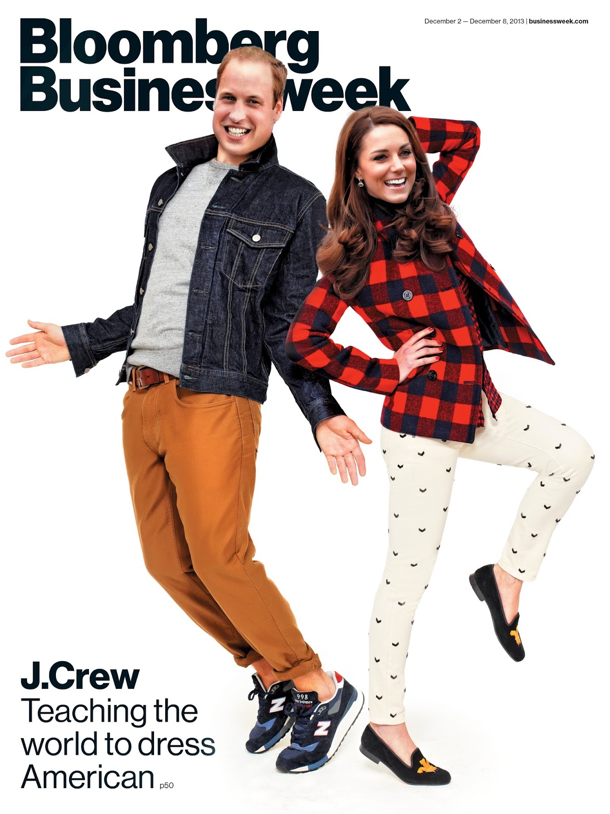
PhotoJ - My favorite Magazine Cover

Photographer: Martin Schoeller
Designer: Arem Duplessis
"For this cover story on the U.S. women’s ski-jumping team, we featured the Olympic hopeful Sarah Hendrickson as photographed by Martin Schoeller. Schoeller captures the competitive spirit of Hendrickson, who wears her competition gear, in her body posture and intense gaze." - 
See more at: http://www.magazine.org/asme/magazine-cover-contest/past-winners-finalists/2014-winners-finalists#sthash.RKR916Tk.dpuf


I really like that picture because I'm a big fan of winter sports, especially skiing, and ski-jumping. I think the portrait of the olympic jumper is really good, because it has bright colors in it but it is not overloaded with color. Also I appreciate that there is just a plain background, so the focus is on the person. The light and exposure of the picture is also really good, because it is not blurry or pixelated or something like that, so I guess the photographer used a low ISO. I think the cover is kind of interesting because the girl looks a little bit frightened but it also catches your eye with that. 

PhotoJ - Best Magazine Covers 2013


1. formal
2. informal
3. environmental
4. environmental
5. informal / environmental
6. formal
7. environmental
8. informal
9. informal        /           formal
10. formal
11. formal
12. formal
13. informal / environmental
14. formal /  environmental
15. informal
16. environmental
17. informal

PhotoJ - Magazine Tips

1. I should ask myself for what kind of magazine I want to design my cover.

2. I should try not to judge my cover when it's on the screen.

3. I should buy a random magazine and try out, how the parts of my cover fit on the magazine size and how it works together.

4. The cover should pop out from its background.

5. I also should gather copies of famous and best sold covers, so that I know what the people are interested in.

Montag, 10. November 2014

PhotoJ - American Soldier Slide Show and Captions (Review)


  1. 1. The Pictures:
    1. A: For me picture #47 is the most powerful picture, because it shows so much emotions between Ian and his best friends, even it is really simple.
    2. B: Locations:
      1. 1. At home in Denver: #1 - #7
      2. 2. At basic Training: #8 - #48
      3. 3. In Iraq: #49 - #70
      4. 4. Back in Denver: #71 - #82
    3. C: I think the pictures work together as a story first of all because of their captions and because the show little steps which are important and there is not so much time between the pictures so that you miss almost nothing of Ian's story.
  2. 2. The Captions:
    1. A: In the pictures where Ian is the main subject almost all of the verbs are written in present tense.
    2. B: The captions show you exactly what is going on and what Ian is doing at the moment. 
  3. 3.
Image #48: Ian and his father are walking along the isle in the grocery store for the last time before he will go to the basic camp the upcoming 3 months. After graduation in May 2007, Ian decided to join the army and serve for his country. 

Image #65: While Ian is waiting for an important call from his mother, he is taking a nap because the basic training and living as an soldier is really exhausting for a young grown-up. This picture was taken in the first 2 weeks after he arrived at the basic camp in November 2007 to start his journey as an army soldier.

Image #77: Ian just arrives from the Iraq and walks to meet all of his friends and family after six months of serving there. After the three months of basic training Ian decided in February 2008 to continue serve his country so that he went to Iraq to fight and luckily arrived safely back home after six months.